Blog (my web musings)
Find out what's interesting me, get tips, advice, and code gems that don't fit elsewhere.
Search Blog
Circular Segment Pie Chart Menu (experimental)
- Details
As part of a school website's responsive rebuild, I wondered if it would feasible to remake this dartboard-esque "faculty web" menu and convert it from an image into pure CSS. Well, it is possible, but not without glitches - follow my journey from this to this (best viewed in Firefox, Opera and Chrome) below, and grab a more refined "take-away" freebie too.
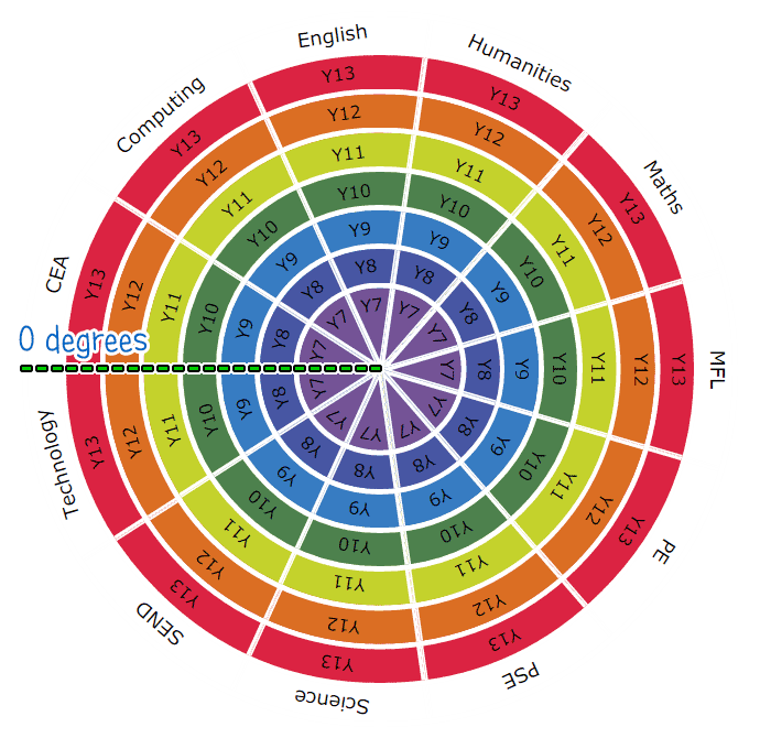
- Inspiration: Image-Based Faculty Web (made with images)
- Result: CSS-Only Faculty Web (CSS only, too intense, IE croaks)
- Take-away Demo: Circular Segment Pie Chart Menu (more stable, IE still croaks)
The "faculty web" demo is much easier to follow with pictures to illustrate key steps, so you'll see those dotted throughout this post.
Setting up the base
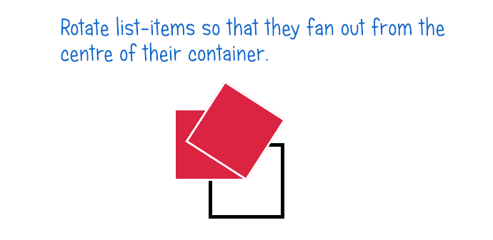
First I set about creating the first layer of the pie chart menu - a circle divided into 11 equal segments. The markup for this is just an unordered-list inside a container div. I coloured them red, added a few borders and used negative positioning to pull them out from the centre of their container. Notice how the bottom-right corners sit in the middle. Additionally, transform-origin: 100% 100%; is used to ensure that the list-items eventually fan out from the bottom-right corner, rather than rotating around their own centre;

Rotating the segments
Then I began rotating the list-item squares with the CSS transform property. Each uses a different rotation angle to move it further around the circle, that is calculated like this;
- base angle = (360 / number of segments)
- rotate angle = (nth-child - 1 x base angle)
Here is an example using the first 2 list-items, targetted with nth-child() - I haven't included any vendor prefixes, although they are included on the demo page(s);
.pie li:nth-child(1) { transform:rotate(0deg); }

.pie li:nth-child(2) { transform:rotate(32.7272727273deg); }
And here's what the first rotated list-item looks like;
Keep going and all rotated list items together look like this;

Skewing the segments
The next thing to do is to correct the centre angles so that the points fit sharply together without overlap. That is achieved by skewing each list-item (for those of you familiar with Photoshop's skew tool, it's like twisting at the corner of an image to stretch and distort it) and here's the calculation for that;
- base angle = (360 / number of segments)
- skew angle = (90 - base angle)
An example using the first 2 list-items again, where rotate and skew are chained together in one transform;
.pie li:nth-child(1) { transform:rotate(0deg) skew(57.2727272727deg); }
.pie li:nth-child(2) { transform:rotate(32.7272727273deg) skew(57.2727272727deg); }
All the list-items are skewed by the same amount - the result of which looks like this;

Ooooh, pretty!
Confining segments to the container
But those spikes are way too excessive, so I set overflow: hidden; on the container to hide the excess;

Making the container round
And add border-radius: 50%; to make a circle;

Un-skewing text
That's pretty much the essence of what I want, but now for a stumbling block - the text for each list-item. The problem here is that each list-item is rotated and skewed, which means the text inside is rotated and skewed as well, so it has to be undone - a reverse skew and rotate CSS transform to restore it to it's former glory. More calculations;
- base angle = (360 / number of segments)
- skew angle = (base angle - 90)
- rotate angle = (base angle / 2 - 90)
The CSS tranform for un-skewing the list-item link text looks like this - minus vendor prefixes;
.pie a { transform:skew(-57.2727272727deg) rotate(-73.6363636364deg); }Almost there...
With that in place, the text is straightened out. A few more inner circles, colours and sizing adjustments, and...;
First segment on top
Another problem - the first list-item ("CEA" in the picture) isn't rotated because the CSS transform for that element is set to 0 degrees. This is the equivelant of the "horizon line", so the first list-item pie-segment sits at the 9 O'clock position. If you want item 1 to start from the top / 12 O'clock, more calculations are needed to deal with the rotation on the outer container;
- base angle = (360 / number of segments)
- rotate angle = (90 - (base angle / 2))
Which looks something like this;
.pie { transform: rotate(73.6363636364deg); }Fixing broken link areas
Another problem! Due to all this skewing and rotating, the active link areas were all screwed up - hovering / clicking over "cells" caused neighbouring "cells" to activate. Some were completely obscured. So I resorted to CSS pointer-events to kill the active links outside each circle container...;
.pie { pointer-events: none; }...And then return them to contained anchors;
.pie a { pointer-events: auto; }Flipping upside down text
I could have called it quits at that, but I didn't like the way that the text was upside down on the bottom half of the menu. I scratched my brain for a while on this one and decided to use dummy text in a pseudo-element so that I didn't need to skew the anchor element any more (which, to be honest, had already done a good job of frying my brain);
.pie .flip a { color:transparent } /* make the real text invisible */
.pie .flip a:after { content:attr(data-text);

display:block; height:0; color:#000; transform:rotateX(180deg) rotateY(180deg) } /* flip the dummy text */
The text content of the pseudo-element is taken from the data-text attribute, set up like this in the HTML markup;
<li class="flip"><a href="#" data-text="Science">Science</a></li>And because the text is confined to a "data-" attribute (HTML5), it isn't contaminating the markup with text that would be visible on screen or via a screen reader!

Fixing iOS
Yey! I was all ready for patting myself on the back at this stage, until I saw what effect this dummy text-flipping lark had in iOS...

Grumble, grumble... another problem! Annoyingly this only happened with the addition of the text-flip CSS transform:rotateX(180deg) rotateY(180deg);, and after a bit of research, I tied it down to a bug where iOS doesn't respect overflow: hidden; with border-radius - I found the fix at Stack Overflow;
.pie ul { border-radius: 50%; -webkit-mask-image: -webkit-radial-gradient(circle, white, white) } /* http://stackoverflow.com/a/16109635 */The end!
Well, sort of...
As it turns out, the "faculty web" menu doesn't play nicely with IE. Not even version 11, which by all accounts it should do because all the critical CSS things are supported. The menu looks fine when the page loads, but dies a death when any of the cells are hovered. And all those cells (77 transformed elements, and then some) are way too intense for some mobile devices too - crashing the browser if zooming is attempted :(
Oh, this just isn't my day! *shrug*
Well, I learned some new techniques along the way so it isn't a total loss. I guess the "faculty web" will just have to stay image-based for now.
I've included a link to a more refined (and much reduced) version below, which is much more stable (fewer segments = more stable, fewer rings = more stable), except in IE (pah!).
Take-away Demo: Circular Segment Pie Chart Menu (experimental):
It might still be useful for personal projects - maybe as a dartboard or zodiac wheel?
Thanks for keeping me company on my journey. Now, who's ready for a cup of tea?...
Search Blog
Recent Posts
Popular Posts
Latest Scripts
- Scroll Down Before/ After Effect Image Switcher
- Pop-up Text Message with Entrance Effects
- Log and block email spam IPs w/ PHP + .htaccess
- Responsive CSS3 Blinds Effect Slideshow
- AJAX & PHP 5-Star Rating with Flat File Storage
- Defer YouTube Load until Scrolled-To (Lazy-Load)
- Keyboard Accessible 'Tab-to' Menu (JS)
- Defer Image Load until Scrolled-To (Lazy-Loading)
- Scroll Wide Tables w/ Gradient + Indicator (JS)
- Convert anchors to spans (LinkAdv/ Atto in Moodle)