Blog (my web musings)
Find out what's interesting me, get tips, advice, and code gems that don't fit elsewhere.
Search Blog
Img Src to Background-Image - Dealing with images inserted via a CMS
- Details
This small JavaScript function converts the src attribute of an <img> tag into a CSS background-image, where background-size:cover; kicks in for visual containment and faux-cropping. In other words, it forces image size to be consistent.
Backstory
While I've been working with folks who update their own web pages - training them to use a CMS and the likes - one common issue that crops up has to do with the arrangement of images on a web page. Inevitably, at some point, usually weeks after the sit-in training sessions are over, the web-editor-person gets creative with floats (via the left / center / right alignment buttons on a WYSIWYG toolbar) and begins dragging corners of inserted images to visually resize them along a row. Unfortunately, the resulting jumble of sizes looks messy and distorted, so my goal was to create a bit more uniformity.
Img Src to Background-Image + object-fit:cover; polyfill for IE / Edge:
Compatibility
Works in modern browsers and IE9+. IE8 users will see the Figure 1 problem format below.
The Problem
Images inserted into a web page via an <img> tag can be resized / scaled, but their sizing can be inconsistent (Figure 1).
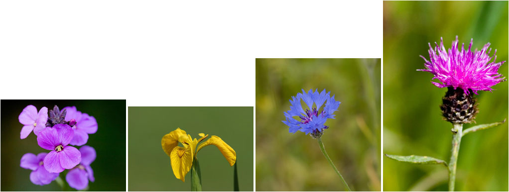
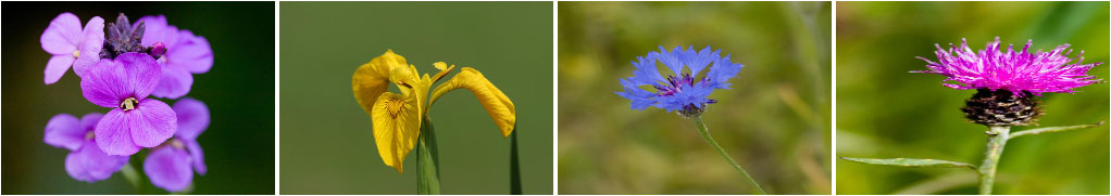
If we set a height and width in the CSS to force size uniformity, the images get squished / stretched to fill the space (Figure 2).
The CSS3 object-fit property can fix the problem in Chrome, Firefox, Safari, and Opera, BUT, it isn't supported in IE or Edge!
A Workaround
We could switch to <div> tags instead, and use CSS to set each picture as a background-image, with background-size:cover; to scale proportionally while we resize, BUT, this doesn't translate easily for use within a CMS. It would be great if we could somehow make background-size:cover; work on <img> tags until IE / Edge supports object-fit...
A Solution
Here comes the magic JavaScript;
function fitImg(imgClass) {
    var imgs = document.querySelectorAll(imgClass), i;
    for (i = 0; i < imgs.length; ++i) {
       var img = imgs[i],
            url = img.src;
       img.parentNode.style.fontSize = '0'; /* counteract extra spacing from inline-block */
       img.src = "data:image/gif;base64,R0lGODlhAQABAIAAAP///wAAACH5BAEAAAAALAAAAAABAAEAAAICRAEAOw==";
       img.style.backgroundImage = "url('" + url + "')";
        }
    }

fitImg('.fit-img-landscape');
fitImg('.fit-img-portrait');
The fitImg(); JavaScript function noted above and demonstrated in the demo, takes the URL from each image's src attribute and applies it as a CSS background-image instead, where background-size:cover; can take effect via CSS. A transparent .gif (in data URI format) is set as the src to avoid broken image icons being displayed by the browser.
When you view the demo, note how the same image can be set to landscape or portrait, and background-size:cover; will auto-fit it. Parts of the image that fall outside of the pre-defined placeholders will be cropped. Aspect ratio is maintained - no stretching or squishing.
For the demo I have structured the markup as a CMS would generate it (images are usually inserted inside a paragraph);
<p><img class="fit-img-landscape" src="/pic-1.jpg" alt="" /><img class="fit-img-landscape" src="/pic-2.jpg" alt="" /><img class="fit-img-landscape" src="/pic-3.jpg" alt="" /></p>
But if you inspect one of the image elements with Developer Tools (F12), you'll see that the markup has been changed to;
<img class="fit-img-landscape" style="background-image: url(/pic-1.jpg)" src="data:image/gif;base64,R...ICRAEAOw==" alt="" />
The fitImg(); function takes things one step further and makes use of the <p> wrappers within a CMS to overcome another problem - removing whitespace between inline-block elements by setting font-size:0; on the parent element. If this doesn't suit your own setup, remove this line from the script;
img.parentNode.style.fontSize = '0'; /* counteract extra spacing from inline-block */
Usage Suggestion
I have this setup with various installations of TinyMCE (my preferred WYSIWYG web page editor) as a custom styles selection on the WYSIWYG toolbar; The user embeds an image then can easily apply to it a class of either .fit-img-landscape or .fit-img-portrait for landscape or portrait proportions respectively. It works pretty well :)
I hope you find it as useful as I do.
Search Blog
Recent Posts
Popular Posts
Latest Scripts
- Scroll Down Before/ After Effect Image Switcher
- Pop-up Text Message with Entrance Effects
- Log and block email spam IPs w/ PHP + .htaccess
- Responsive CSS3 Blinds Effect Slideshow
- AJAX & PHP 5-Star Rating with Flat File Storage
- Defer YouTube Load until Scrolled-To (Lazy-Load)
- Keyboard Accessible 'Tab-to' Menu (JS)
- Defer Image Load until Scrolled-To (Lazy-Loading)
- Scroll Wide Tables w/ Gradient + Indicator (JS)
- Convert anchors to spans (LinkAdv/ Atto in Moodle)