Blog (my web musings)
Find out what's interesting me, get tips, advice, and code gems that don't fit elsewhere.
Search Blog
Change viewport metatag when matchMedia detects width
- Details
A few months ago I was involved in a discussion on the CSS Tricks forum, where a fellow developer had built some non-responsive website applications.
The required minimum layout width was 960px, expanding wider when more space was available, but the min-width had caused issues on iPad where the initial view was zoomed in on its 768 x 1024px screen.
I don't have access to the actual problem site, but I recreated the issue on an old non-responsive site of mine that displays best at a minimum 1024px resolution.
Here's evidence of the initial 'zoomed' glitch when there is no viewport metatag present in the <head> of the web page - you can see that some of the banner pieces are missing from the right-hand side of the screen and the darker purple background doesn't reach all the way to the edge;

The original developer had attempted to solve the problem using a viewport metatag set to device-width, with initial and maximum scale set to 1;
<meta name="viewport" content="width=device-width, initial-scale=1, maximum-scale=1" />
This solves the issue in landscape;

But the web page displays horribly in portrait, where even more of the right-hand side is missing;

The original developer had consequently been led to this conclusion as the best fix for his situation;
Is there a way to have the content scale / shrink in a portrait viewport when there isn't enough room, but maintain it's actual size in landscape?
...
Would I be better off using something like:
<meta name="viewport" content="width=960" /> ?
...
But I suppose that wouldn't allow the content area to grow in width if there was more available space?
So, his thought-process was spot on. He'd just been unable to implement his solution.
So I offered my own...
OK, how about if you only apply the width=960 viewport on screens that are 960px or less. On larger devices, use width=device-width. You can do it with JavaScript and matchMedia.
Method
First make sure that your viewport tag is in the <head> of your web page;
<meta name="viewport" content="width=960" />
Then add this JavaScript to the bottom of your page – above </body>;
<script>
if (window.matchMedia) {
    var mq = window.matchMedia('(max-width:960px)'),
       viewport = document.querySelector('meta[name=viewport]');
    mq.addListener(checkViewPort);
    checkViewPort(mq);
    }
function checkViewPort(mq) {
    mq.matches ? viewport.setAttribute('content', 'width=960') : viewport.setAttribute('content', 'width=device-width');
    }
</script>
Here, matchMedia checks the viewport width as it changes, either when dragging the edge of a desktop browser, or by changing the orientation of an iPad / tablet, and fires the checkViewPort(mq); function at every change. If conditions are met (when width is less than 960px), the viewport's content attribute is given a value of width=960, else it is given a value of width=device-width.
This worked an absolute treat! The layout was shrunk to fit the iPad screen in portrait (a 960px wide layout shrunk into a 768px viewport), and allowed to flow to whatever space it needs in landscape (1024px of available space).
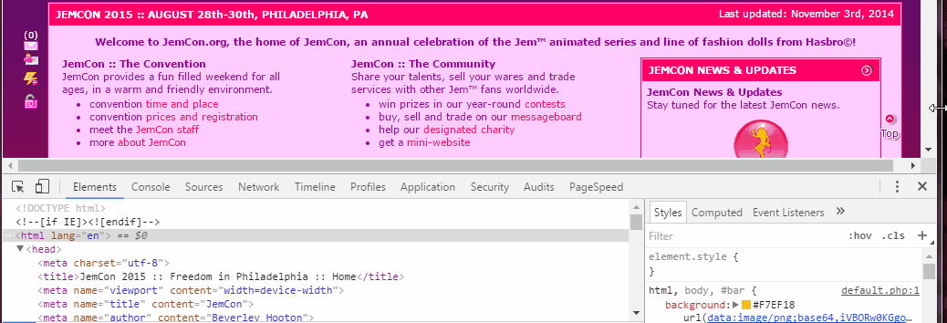
You can see the code in action on the JemCon.org.uk demo site. Hit F12 to bring up the developer console and resize the browser to see the viewport tag content attribute change. Here's an animated gif to illustrate;
Search Blog
Recent Posts
Popular Posts
Latest Scripts
- Scroll Down Before/ After Effect Image Switcher
- Pop-up Text Message with Entrance Effects
- Log and block email spam IPs w/ PHP + .htaccess
- Responsive CSS3 Blinds Effect Slideshow
- AJAX & PHP 5-Star Rating with Flat File Storage
- Defer YouTube Load until Scrolled-To (Lazy-Load)
- Keyboard Accessible 'Tab-to' Menu (JS)
- Defer Image Load until Scrolled-To (Lazy-Loading)
- Scroll Wide Tables w/ Gradient + Indicator (JS)
- Convert anchors to spans (LinkAdv/ Atto in Moodle)