Blog (my web musings)
Find out what's interesting me, get tips, advice, and code gems that don't fit elsewhere.
Search Blog
Responsive Multi-Level, Push / Slide Menu
- Details
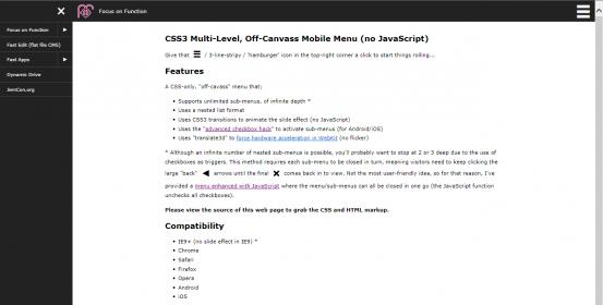
I was emailed the other day by somebody asking if my earlier CSS-Only Multi-Level, Off-Canvas Mobile Menu could be visible on desktop too.
At its most basic level, the following CSS inside of a desktop media query will do that;
#menu { left:0 }
.container { padding-left:13.75em }
Except this stumps IE8 and under because of no media query support and no checkbox hack support. So I set to work on creating a version that is visible (and works) on desktop and older browsers.
First Problem
The basic CSS above does a reasonable job, and looks / works fine on my small 1280px monitor. Its a different matter on a 1920px wide screen though - here's the result;
A column of content with big white margins at each side. Not good. You could increase content to 100% width, which might work well in some wide-screen, masonry layouts, but I imagine that lots of people would want to restrict content width, past a certain point, to maintain some control. Which leads to...
Second Problem
I set a max-width on the <body> tag while testing, and discovered that those off-canvas sub-menus aren't so off-canvas anymore;
Nasty! But how to deal with it?... Well, after a bit of thought, and much faffing with z-index, opacity and positioning of sub-menus, I hit on the idea of using a pseudo element, placed to the left the #menu div, to cover the off-canvas sub-menus... And it worked a treat!
The simplest way is to set overflow:hidden; on #menu (doh!)
Here is the improved, responsive menu - offering desktop and mobile off-canvas functionality. I call it "Responsive CSS3 Multi-Level, Push / Slide Menu (no JavaScript)":
Key Features
Same as the mobile only version;
- Supports unlimited sub-menus, of infinite depth *
- Uses a nested list format structure
- Uses CSS3 transitions / transforms to animate the slide effect (no JavaScript)
- Uses the "advanced checkbox hack" to activate sub-menus (for Android / iOS)
- Uses "translate3d" to force hardware acceleration in WebKit (no flicker)
* Keep it sensible and user-friendly - 2 or 3 sub-menus is usually enough.
Compatibility
Should be fine on all modern browsers and IE9+ (the menu works in IE9 but there is no slide effect). IE8 and under is covered with an alternative fly-out desktop menu.
For more info and to grab the CSS and HTML, please visit the demo and view the source of the page.
JS enhancement
Additionally, I've also provided a JavaScript-enhanced version of this responsive menu - a few very short lines of code to uncheck all checkboxes of the off-canvas sub-menus and return the menu to a closed state in one click. I also included a fallback for when JavaScript is disabled that returns menu behaviour back to the CSS-only version. The JS enhanced menu is here:
This came with its own challenges - Chrome handles z-index differently to Firefox and IE, which means that there is a bit of extra markup and CSS to workaround those differences. More on that in the actual demo page with JavaScript.
Search Blog
Recent Posts
Popular Posts
Latest Scripts
- Scroll Down Before/ After Effect Image Switcher
- Pop-up Text Message with Entrance Effects
- Log and block email spam IPs w/ PHP + .htaccess
- Responsive CSS3 Blinds Effect Slideshow
- AJAX & PHP 5-Star Rating with Flat File Storage
- Defer YouTube Load until Scrolled-To (Lazy-Load)
- Keyboard Accessible 'Tab-to' Menu (JS)
- Defer Image Load until Scrolled-To (Lazy-Loading)
- Scroll Wide Tables w/ Gradient + Indicator (JS)
- Convert anchors to spans (LinkAdv/ Atto in Moodle)